Driving a revolutionary way to discover new features within Power Pages
Since Power Pages became generally available in October 2022, the business pursued an ambitious growth path to establish it as a leader in the low-code, no-code market. This ambition led us to outline a product roadmap filled with numerous value-driven features for low-code, no-code website development. With the intervention of AI changing the landscape around us, and leveraging Microsoft's strategic partnership with OpenAI, we had to completely reimagine the product experience and rethink how we could enhance both existing and future capabilities of Power Pages.
Problem
Despite the evolution of Power Pages since its general availability, and as per our product telemetry, our maker personas are not fully utilizing the relevant features to enhance their productivity in website building and are missing out on discovering many value-added features. Although these updates are communicated through product release notes, the product blog, and a universal First Run Experience (FRE) framework from our existing design system, the current approach is not effectively reaching or engaging our users.
Diagnosis
Given the growing problem and concerns about the declining adoption rate of key features, I initiated and led a V-team comprising Researchers, Product Designers, and Content Specialists to delve into the issue.
The main objectives were to understand:

01.
How many users ignore the FRE notification/modal without proper review?
02.
Why users don't read the notifications in detail and whether they are interested in learning more about new features.
03.
How users educate themselves about newly released features.
04.
The most effective ways to inform and educate users to ensure new features are noticed.
05.
Users may want full control in discovering new features, prefer alerts during interactions, or a mix of both.
Discovery


Prescription
Good teaching UI is relevant and educational to the user, and enhances the user experience. It should be simple, memorable, and immediately relevant.
Simple
Users don't want their experience to be interrupted with complicated information
Memorable
Users don't want to see the same instructions every time they attempt a task, so instructions need to be something they'll remember.
Immediately relevant
If the teaching UI doesn't introduce user to something they want/need to do, they won't have a reason to pay attention to it.
Do
-
Understand the problem before you solve it
-
Get to know your users: how they arrive at your product, what state they are entering it at, what are the most immediate needs do they have to be successful in it right away, in a day, in a week.
-
Introduce new information in a logical progression.
-
Contextualize the learning–educate when and where it’s needed.
-
Focus on how to do something, guiding users to action.
-
Use progressive disclosure so users are not overwhelmed with information.
-
Make it easy for users to return to the task at hand.
Don't
-
Do not use learning UI as a fix for bad UX experience!
-
Do not teach fundamental or obvious features. Know your users. If they can figure out a feature on their own without instruction, then the teaching UI will just get in the way. Don’t waste users’ time by stating the obvious.
-
Do not interrupt the workflow. Don’t interrupt users when they are in the middle of an unrelated task. Instead, identify contexts in which your feature is relevant and leverage these as triggers to provide complementary experiences.
-
Do not introduce actions in the way different from how they are going be initiated/performed later in the product. User need to know how to perform an action when learning UI is not there anymore.
-
Do not obscure important information.
Establishing guardrails for the Design Team
To align with Microsoft's vision and maintain consistency across its product portfolio, insights into the typical user journey within the Microsoft enterprise domain were collected from established portfolios. This knowledge was then tailored for Power Pages users, aiding the design team in recognizing suitable design system patterns and exploring new opportunities within the product.
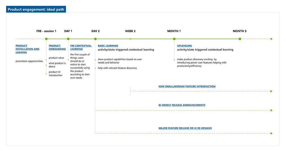
Product Engagement lifecycle
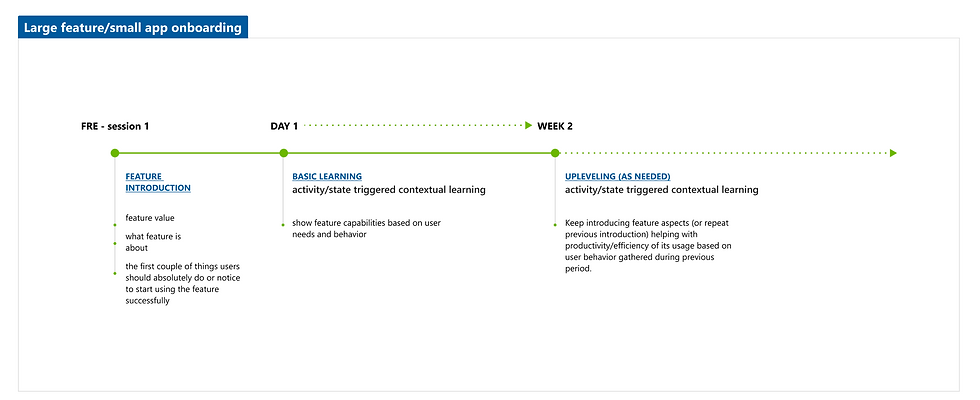
Feature Engagement lifecycle
Breakthrough
These initial insights and directions were essential in increasing the adoption of key features and creating an innovative approach to enhance the discovery of new features within Power Pages.
Moreover, the new entry point for discovering "What's New" in Power Pages within the global header benefits other products in the Power Platform suite. This allows all products to leverage users' muscle memory, as many users frequently use multiple products, and can be customized to fit individual product preferences.


Impact
The announcement and discovery of the Power Pages In-App feature for our Maker personas led to a 6% increase in daily active users (DAU), while the feature adoption rate rose by 33%.
These enhanced user engagement metrics offer the product and design teams a broader spectrum of user feedback, allowing to assess and refine product features to drive better delight and strategically plan upcoming experiences.
Overall, this design initiative established a solid foundation for the product to enhance feature discoverability and ensure our targeted personas are well-informed about all product releases, addressing the issue of low adoption due to lack of awareness.
29%
growth in maker MAU in last two months of shipping
23%
growth in maker WAU in last two months of shipping
